Tag Archives: love colour

Bold Burgundy

Posted On: Monday, November 24, 2014

Burgundy is a beautiful rich, deep colour that has many tones to show off. It compliments well with different colours, so you can brighten it up with orange, white or gold, or tone it with deep purples and browns. Burgundy is the staple colour to any colour palette.

Colour inspiration – African Wax Print Fabric

Posted On: Monday, October 6, 2014


Hello!

I’m Becky from Pretty Dandy. Before I begin I’d like to say a big thank you to Danni for inviting me to be a guest contributor to her blog, what an honour… and a responsibility! I’ll do my very best to keep up the high standard she sets, and I hope all you regular readers enjoy my post.

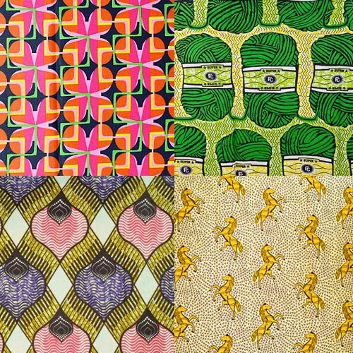
I decided to write about colour inspiration. This is something I do on my own blog from time to time to share ideas for new and interesting ways to combine colour. I find inspiration in lots of different places and thought today I would share a long-time favourite of mine… African wax print fabrics. These are traditionally made in Africa (as the name suggests), although there are also a lot of dutch companies producing these designs. There’s a huge range of prints, usually produced in small batches, and the designs they create are fabulous.

If you’re a fan of bold colour, then you will love these. They combine palettes in surprising and beautiful ways, with contrasting shades and beautiful hues throughout. And that’s before you even look at the detail of the design!

I always find myself particularly attracted to the fabrics which use just two or three bold colours, but you can also find beautiful prints in more muted tones, or which just use a single colour. There’s no end to the creativity of these fabrics and new designs come out all the time, which means more new inspiration for us!

Pink and green is a great combination – a bright mid-tone of both works really well, especially when used in fairly equal amounts like this:

Different shades of green can work well to create a harmonious whole:

Yellow & deep pink, with lighter tones to contrast with the strength of the pink. Lovely.

Pink, orange and green – sixties colours, brought together against a dark background and looking wonderful.


Purple and pale grey make a beautiful combination. A less ‘hot’ colour combination than some of the ones above, but still very stylish and easy to use in a whole room décor scheme.

I love the delicate lemon yellow and baby blue combination here with a warm charcoal grey to balance them out. Would be fab in a nursery.

Continue reading

Colour Trend Picks for 2015

Posted On: Monday, September 22, 2014

I have an exciting colour post to share with you today – just a little something to brighten up your Monday!

Over the past year Pantone have been releasing their Fashion colour report/trends for 2015, with some mouthwatering colours on offer. With many colours to choose from I have picked out my three favourites to share with you; Strawberry Ice, Scuba Blue and Lucite Green. Now without realising I have already blogged about similar colours in the past; Mint & Blue Hues and Coral Crush but these are slightly different shade, and are well, just lovely.

I don’t usually post about fashion trends, but these colours will filter down into the interior and homeware market, so you can be the first to have these wonderful colours in your home.

Pink Montage

Strawberry Ice is a cool and refreshing colour that has a warmth to it. Pantone state that Strawberry Ice is a confection colour that emits a flattering and healthy glow.

Blue Montage

Scuba Blue is a beautiful and refreshing colour, that coveys a sense of freedom and playfulness. I think Pantone have got this hue of blue just right.

Lucite Green is a wonderful shade, with dark mint undertones that offer a warm sense and feel to it. Similar to Lucite Blue, it also has a cool and refreshing tone, giving it a playful edge.

More Pantone Fashion Colours can be found here

I saw this & thought

Posted On: Monday, September 8, 2014

ISTT10

Without realising I have had a theme running through my photo’s; rustic nature. I first noticed it when I began putting this post together, the colours are quite rustic and I feel like I’ve been away at a countryside retreat somewhere in the Provence regions of France, sadly I haven’t, everything you see here was shot in good old Yorkshire. It’s pleasantly surprising what this lovely country has to offer…

Continue reading

No Ordinary Animals

Posted On: Wednesday, February 26, 2014

Whilst on my travels through Pinterest, I kept noticing these unusually painted, plastic animals. The bright, contrasting colours give these animals a whole new look, and you forget what they should actually look like.

Some of the best examples of these painted animals can be found on The Good Machinery website, where they have taken their designs even further and created wonderful patterns, and even gradient tones on some of the animals. Here are some of their unusual, but brilliant creations…

http://thegoodmachinery.bigcartel.com

Green is the Colour

Posted On: Monday, February 24, 2014

Green Montage

I thought I would upload a different post to usual; I wanted to share my love for the colour green with you all. I can’t even explain why I love this colour so much; from the beautiful emerald tones to the palest of mint greens, this wonderful colour makes me feel happy. I’ve even dedicated a Pinterest board to it, and if you’re a lover of all things green, you can follow my board here.

Enjoy x